Welcome
Starters Restaurants are the #1 FAMILY Sports and Entertainment Restaurants in the Lehigh Valley. Click on any logo below to learn more about each location.
"Taste the Home Field Advantage!"
17 W. 2nd Street
Bethlehem, PA 18015
610-625-2300
"Open to the Public Year Round!"

400 Illicks Mill Road
Bethlehem, PA 18017
610-625-0060
"Great Food. Great Times."
3731 Route 378
Bethlehem, PA 18015
610-997-5454
Gift Cards
Looking to puchase a gift card. You can either pick one up at one of our three locations, or you can go to our gift card website:
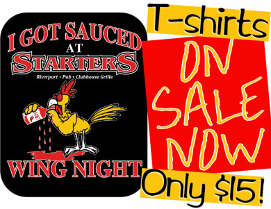
Starters T-Shirts
Starters is now selling our Wing T-Shirts for only $15.00 each. All sizes available. Come to your favorite Starters location and pick one up for yourself!